
Product Badge Design That Matches Your Brand
Off-the-shelf badge colors rarely match a premium brand's palette. See how to customize badge design without touching theme code.

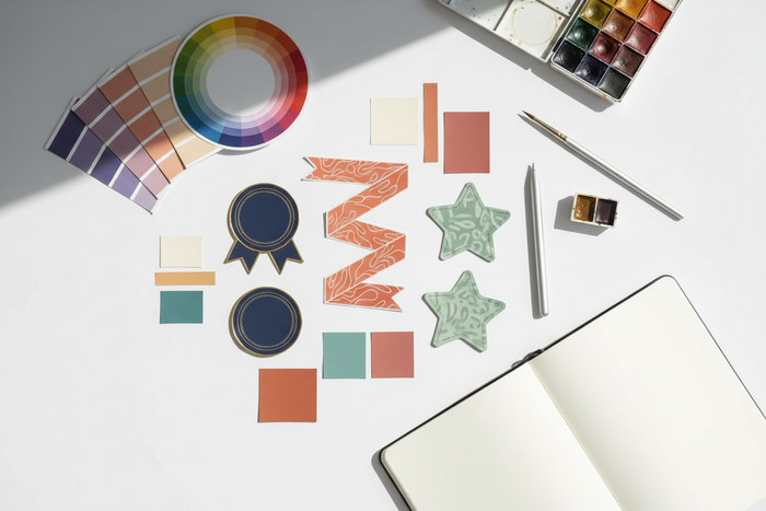
A bright red "Sale" badge might work fine for a fast-fashion store, but it looks jarring on a jewelry site built around a muted, neutral palette. Default badge styles are designed to be generic enough for any store, which means they are rarely a perfect fit for a brand with a specific, carefully chosen visual identity.
Getting a badge to actually match a brand palette usually sounds like a job for a developer — custom CSS, theme file edits, testing across pages. For most stores, it does not have to be. This guide covers how to get badge styling aligned with your brand without touching theme code.

Why Default Badge Styles Clash with Premium Branding
Most badge mismatches come down to two things: the default color set was not built with your palette in mind, and fixing it through theme code costs more than the problem justifies.
Generic badge colors were not built for your palette
Default badge presets tend to favor high-contrast, attention-grabbing colors — reds, yellows, bright greens — because they are built to work broadly across every store type. For brands built around a quieter or more specific palette, those defaults can look like they belong to a different store entirely.
Hardcoded theme edits are expensive for small style changes
Changing a badge color through direct theme code means a developer has to locate the relevant CSS, test it across every page type, and repeat the process again the next time the palette changes for a rebrand or seasonal update. For a change this small, that is a disproportionate amount of ongoing cost.
No-code styling keeps small updates manageable
When badge styling can be updated through app settings, merchants can keep visual details aligned without creating a developer ticket every time a campaign, palette, or product label changes.
| Approach | Speed of Change | Ongoing Cost |
|---|---|---|
| Hardcoded theme CSS | Requires developer time for every change | Recurring cost each time the palette updates |
| No-code badge customization | Adjustable directly in app settings | One-time setup, no recurring dev cost |
Matching Badges to Your Brand Without Code
Most of what is needed is already documented in your brand guide — the work is just translating it into badge settings.
Pull exact colors from your brand guide
- Get the exact hex codes for your primary, secondary, and accent colors from your brand guidelines.
- Apply the primary or accent color to badge backgrounds, reserving high-contrast colors only for genuinely urgent messaging like low-stock alerts.
- Match badge typography to your theme's font where the app allows font customization.
- Review badges against real product photography, not just a blank preview, since color perception shifts against different image backgrounds.
Match badge intent to color strength
Not every label needs the loudest color in your palette. A "New Arrival" badge can use a calm brand tone, while a "Low Stock" or "Final Sale" badge may need stronger contrast because it changes the purchase decision.
Check badge visibility on real product images
A badge may look polished on a plain background but disappear over lifestyle photography, reflective surfaces, or darker product images. Always review badge colors against actual product cards before publishing.

How Lavar Supports No-Code Badge Customization
Lavar's custom colors and badge design controls are built to be adjusted directly from app settings, without editing theme files.
Because badge colors, shapes, and placement are all app-level settings, a palette update does not require a developer ticket. It becomes a direct change that can keep product labels consistent across the store.
Adjust badge colors without a developer
Lavar lets merchants create product labels and badges that can match a store's visual direction instead of relying only on generic preset colors. This is useful when brand consistency matters as much as promotion visibility.
Control badge shape and placement
Badge placement changes how strongly the label competes with product photography. A premium layout may need a smaller, cleaner badge position, while a sale collection may need a more visible placement.
Keep different badge types visually consistent
- Badge colors: Match exact brand hex codes rather than a preset color list.
- Badge shape and placement: Adjust per product or collection without touching theme files.
- Discount, new arrival, and best seller badge styles: Keep each badge type consistent with the same palette.
Use Cases for Brand-Conscious Premium Retailers
Badge-to-palette mismatch shows up most in categories where the visual identity itself is part of the product's perceived value.
Jewelry and luxury goods brands
A generic bright badge can undercut the premium feel a jewelry brand has otherwise built into its photography and layout. Small visual details carry more weight here than in most categories.
Boutique fashion brands with a defined aesthetic
Boutique brands often invest heavily in a cohesive visual identity across their site. An off-palette badge is one of the few elements that can visibly break that consistency.
Artisan and handmade goods sellers
These brands frequently lean on a specific, often muted palette to signal craftsmanship. A mismatched badge color can undercut that positioning more than it would for a mass-market store.
Testing Your Badge Styling Before Launch
A badge that looks right in isolation can still clash once placed against real product photography.
Compare badge colors with exact hex codes
Check badge colors against your brand's actual hex codes, not an approximate match. Small color differences can become obvious when the badge sits next to product images, buttons, banners, or other branded elements.
Review badges across real product backgrounds
Review badges over your most common product photo backgrounds, not just a white background preview. This helps you catch contrast problems before customers see the label in a collection grid.
Recheck styles during seasonal updates
- Confirm badge styling is consistent across discount, new arrival, and any other badge types you are using.
- Re-check badge colors any time your brand palette is updated for a seasonal campaign or rebrand.
- Review the mobile view, where badges can feel more visually dominant than they do on desktop.

Final Thoughts
A badge that does not match your brand palette is a small detail, but it is the kind of small detail customers can notice even if they cannot explain why the page feels slightly off. Getting it right does not require a developer; it starts with the same hex codes already sitting in your brand guide.
FAQ
A few questions come up often from merchants matching badge styling to their brand for the first time.
Do I need exact hex codes or just a close color match?
Exact hex codes are worth using where possible. An approximate match is often noticeably off once placed next to other branded elements.
Should sale badges still use brand colors instead of red?
It depends on your brand. Some premium brands reserve urgency colors like red only for genuinely limited offers, while using brand colors for standard badges.
Will custom badge colors slow down my store?
No, badge styling through app settings should not add meaningful load time compared with a default preset. The bigger concern is whether the badge remains readable across product images and devices.
Read More


